Introduction
As full stack developer you sometime have to code front-end features and what’s better than reading best practice articles before coding? Nothing! After reading this article, you’ll know why you should use rem unit instead of %, em (or worse) px.
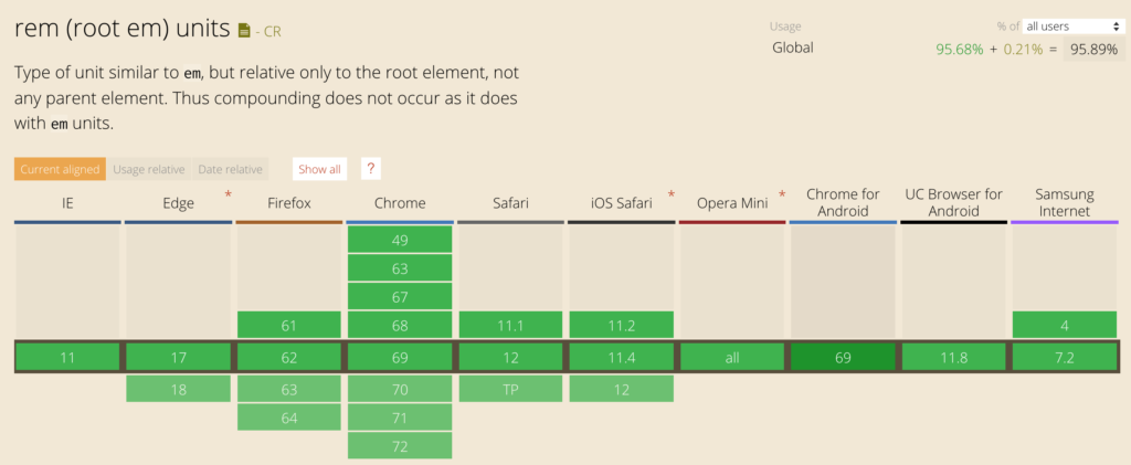
Before using a css spec, you always have to check it’s browser compatibilities. For making that, the awesome CanIUse website is the great tool.
« rem » browser compatibility
Why you shouldn’t use Pixel unit ?
In my opinion, part of the debt of the CSS and design in its generality comes from the non-intelligent use of the pixel. Whether designer or developer, many use and continue to use this unit as the main unit without even knowing the limits.
Not wishing to deepen the operation of the pixel as well as its constraints related to dpi and « false pixels », we will simply say that once a font size (for example) set at 14 pixels, it will always remain at 14 pixels, whatever the resolution of the screen, the size of the window or its zoom.
If, like me, you want to be able to resize or zoom in or out on some sites, you’ve probably already seen that not all sites respond in the same way. Sometimes even, the site becomes totally unusable. It may be that the site you are browsing uses px. We therefore note that the main constraint of the Pixel is that it is not an accessible unit.
Ok, but what’s the difference between Rem?
The rem, most recent and created to be totally « Responsive Web Design » comes to the rescue of all the problems faced by the Pixel in a simple but intelligent way.
The rem is a percentage of the screen calculated by the browser according to many parameters such as the screen zoom and its resolution. Its size inherits from the font-size (for example) sets defined by default in the body.
In other words, say if you set a 100% font-size in the body, then your rem size of 1 will be 100%. This can be handy when you want to resize all your elements up or down.
Unlike the pixel, if you put your font at 1 rem and you resize or zoom the screen, you will realize that the size of this font changes automatically. And that’s all the power of rem! Created to make the web more accessible, many CSS libraries or frameworks such as Twitter Bootstrap (version 4) now use this unit as a base unit. This makes the developments a lot simpler and more efficient. Especially at a time when front-end developers are fighting with thousands of screen resolutions.
Well, said like that you probably think that you have to stop using the pixel or rem? Well no, the pixel is not dead and still useful when you want to set the size of an element that should not vary, such as for margins.
Rem said goodbye to Em!
The em is almost the same thing as the rem with the difference that the size of the em is proportional to the size defined in the parent unlike the rem which is proportional to the size of the text defined in the body.
Conclusion
To conclude, I propose you to show this amazing Gif which it simulate a window resizing.
« Pixel » versus « Rem »
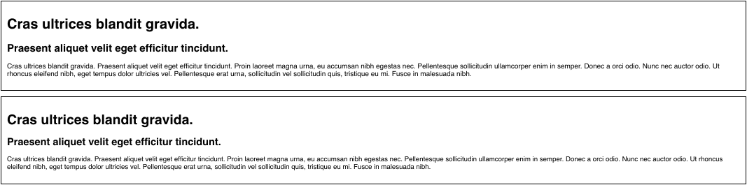
First block font-size is set in Pixel, the second in rem.
For more informations
Leave a comment